- 首页
- International
- 艾特奖
- 文化节
- 服务体系
-
网站导航
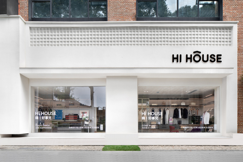
HI HOUSE家居生活体验馆位于成都,项目改造前是一个70年代的老厂房。本次设计的目的就是在这样一个充满年代感的建筑里塑造一个全新的、充满独立气息的家具品牌。
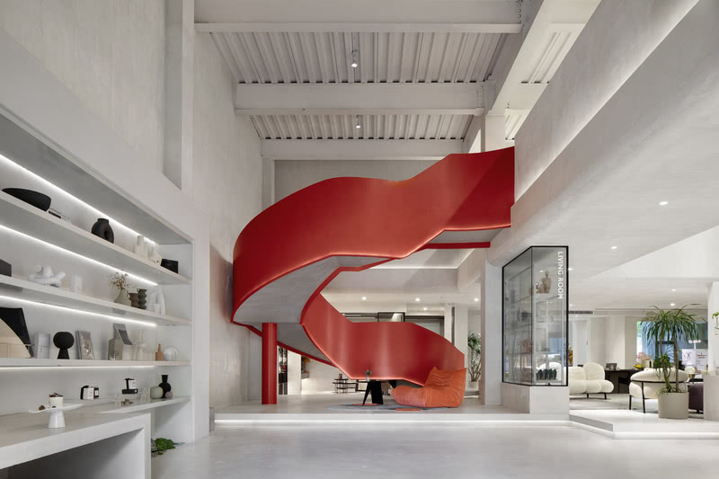
由于原始空间采光严重不足,而单纯的人造光源容易使人有昏昏欲睡之感,因此我们在入口处正对面的场所即设置了红色异形楼梯,加上空间内单纯的浅灰色调对比,形成一种视觉上的张力,刺激消费者的感官体验。红色异形楼梯的造型宛如女性瀑布般的长发,代表了一种柔美、圆润的情绪,消解了大面积浅灰色所带来的冷峻之感。
在空间的设计风格上,我们重点思考了 “生活、品质、个性”这三个关键词。我们认为一个完美的家具的空间,既能够兼具家所应有的包容、放松之感,亦能在风格上体现出的不追逐、不跟随的个性。
整个展厅空间分为两层,一层为情景空间,包含客厅、餐厅、卧室、衣帽间、影音室、品酒区等。整个空间采用了开放式设计,仅有隔断也以少部分墙体外加大面积玻璃为主,从而使各个空间能够互相联动起来,也代表了共通、互融、开放的现代家庭生活理念。
二层功能为沙龙区、设计区和选材区。由于设置了大面积天井,使得整个二层视觉上和一层能够互相联系。行走在二层的过道,一层的整体情况能够尽收眼底。
HI HOUSE Furnishing living experience hall is situated in Chengdu. Before the reconstruction, it was an old factory building of the 1970s, which lacked daylighting and required reinforcement of the architectural structure. The aim of this reconstruction is to shape a new and independent branding of furniture in such a vintage building.
Due to the severe lack of daylighting of the original space and the drowsiness of people which can easily be made by the artificial light, we set up a red non-standard staircase at the place directly opposite to the entrance, which creates a visual tension and stimulates consumers' sensory experiences with the contrast of simple light gray in the space. The red abnormal staircase is styled like a waterfall of long female hair, representing a soft and mellow mood that dissolves the sense of coldness brought about by the large area of light gray.
In the design style of the space, we focused on the three key words: life, quality, and personality. We believe that a perfect furnishing space can be both inclusive and relaxing as a home should be and can also reflect the personality of not following the flow.

外立面

外立面

进门入口