- 首页
- International
- 艾特奖
- 文化节
- 服务体系
-
网站导航
工程名称:无界
设计单位:登胜空间设计
主持设计师:陶胜
参与设计师:徐青华、蔡辉
建筑面积:350m²
主要材料:钢架、瓷砖、钢化玻璃、红橡饰面板。
坐落地点:南京苏宁慧谷中心
完工时间:2016年4月
摄影师:郑雷
南京苏宁慧谷中心CBD项目位于南京河西新区江东商业板块,毗邻长江,有五栋不同朝向的现代化高层写字楼组合而成。本案更是位于CBD一号楼的最顶层,具有得天独厚的开阔视野,向南可展望新城全貌,向西则一线江景尽收眼底。
项目的优势不言而喻,但并非完美无缺。首先,本案由三套独立的loft户型打通合并而成,其中两套为50㎡,一套75㎡。单层建筑面积175㎡,loft户型最大的卖点是一层两用,业主可以轻松得到350㎡。高层写字楼得房率一般在60%—68%,折中一算,最多只有225㎡左右,对比业主提出的众多功能要求,依然有点捉襟见肘。其次,打通之后的平面轮廓成一个“L”形,并且公司的入口在“L”形的“尾巴”上,且不可更改。加上进门空间聚集的结构柱和排污管等,琐碎、局促感由然而生,企业形象也很难得到最佳展现。
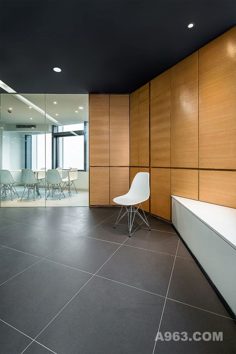
既然无法方正,设计师索性另辟蹊径,对整个空间来了一场大刀阔斧的“切割”,将突兀、拐角空间全部“化零为整”。从前台开始,你可能看不到一面方正的墙体,取而代之的是各种不规则的线面穿插,大量透明玻璃和木饰面材质。玻璃既划分了空间功能,也弥补了空间面积紧凑的问题,空间得到有效拉升和扩容。不规则切面设计有引导人们视线转移的特性,这样很好的处理了视觉上的冲突。甚至延伸了人们的视野,将办公室的内外很好的串联起来。
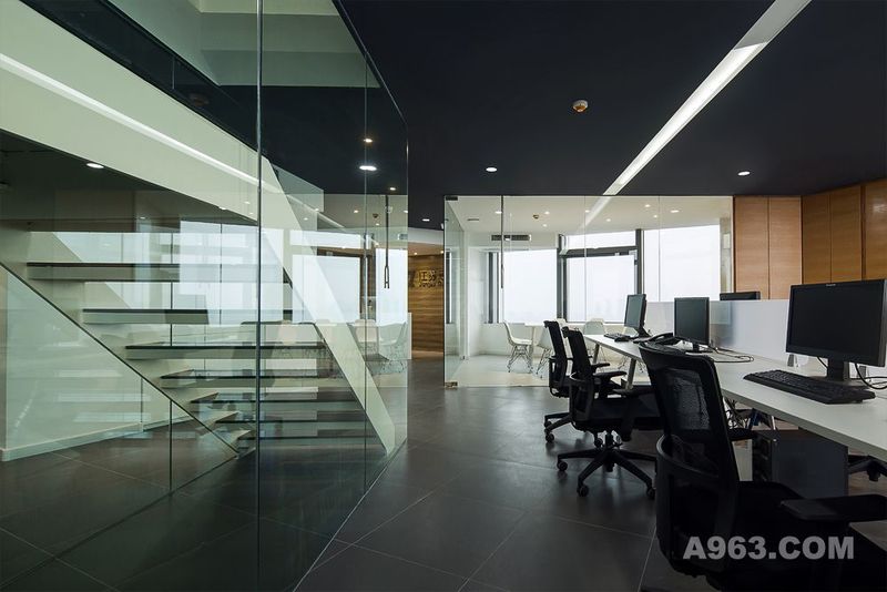
楼梯是Loft户型的一个重要组成部,往往也是整个空间的出点睛之笔。这里楼梯以“V”形呈现,看似不合常理,但却很好的配合了整个空间的不规则布局,显得扎实有力。两侧再配合透明玻璃后,形成一个狭长的带拐角空间,这样一层、二层被更紧密的联系起来,行走上面给人一种独特的穿越感。上到二楼,这样的“切割”也是无处不在,设计师的“将错就错”却达到了“负负得正”的效果。
楼上楼下游走一圈,整个空间有分割无封闭,有界限不隔断,似有非有,似无非无。如此高度,忙时低头伏案,闲时看江船入湾,轻松惬意!
Project name: Unbounded
Design unit: Deesen space design
Designer: Sheng Tao
Participant: Qinghua Xu, Hui Cai
Size: 350 meter square
Main Materials: steel frame, ceramic tile, toughened glass, red oak veneer.
Location: Nanjing City
Completion time: April 2016
Photographer: Lei Zheng
Designing idea:
Nanjing suning ivgl center CBD project is located in jiangdong business sector of hexi new district, Nanjing. Adjacent to the Yangtze river, there are five different towards modern high-rise office buildings. The case is at the top floor of building 1 of the CBD. With a unique vision, we can see whole picture of new city southward, while a panoramic view of Yangtze River westward.
Project's advantage is self-evident, but it is not perfect. First of all, this case is composed of three sets of independent loft apartments through merging, two sets of 50 ㎡, a set of 75 ㎡. Single building area is 175 ㎡. The biggest selling point of loft apartments is a layer of dual-use, the owner can easily get 350 ㎡. Rate of tall office rooms is 60%-68% commonly, calculate compromisely, it is only about 225 ㎡at most. It is still a bit short according to so many functional requirements putting forward by the owner. Second, planar contour is a "L" shape after getting through and the company's entrance on the "tail" of "L" shape, but can’t be changed. Also there are structure columns and drainage pipes at the entrance space, trivial and cramped feeling is by birth. However, the corporate image is difficult to get the best show.
Since unable to be square and upright, designer found a different approach simply, he did a sweeping “cutting” to the whole space. Let abrupt and corner space all be "comrades". From the front desk, you may not see a wall of square and upright, replaced by a various of irregular wire surface, a large number of transparent glass and wood veneer materials. Glass could divide the space functions while make up for the problem of compact space. Space gets lift and capacity effectively. Irregular plane design has the property of guide people attention, it's so good to deal with the conflict on the vision. Even extend the people's field of vision, let inside and outside of the office be in series.
The stairs is an important component of a loft apartment, often is the nods eyeball pen of whole space. Stairs here shows to be "V" shape, it seems counterintuitive, but it is very good with irregular layout, the whole space appears solid and strong. With transparent glass on both sides, forming a narrow space with corner. Like this, first layer and second layer are more closed linked, walk above gives person a kind of unique sense of crossing. Onto the second floor, such "cutting" is also everywhere, designer’s "throwing" has reached "negative negative to be positive” effect.
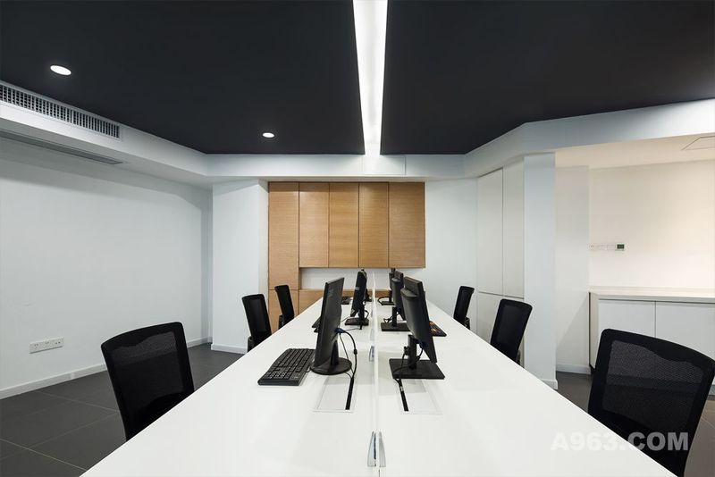
Walk upstairs and downstairs, the whole space is divided but not closed, has boundaries but no partition, seems to have but no, seem not have but have. So high level, down at desk when busy, watching the ships into the bay when free. Relaxed and comfortable.

休闲区

员工区

员工区二